A room for relaxation
The bathroom has become one of the most important rooms in the home. It needs to be functional and practical for the entire family, and it has to have plenty of storage space. At the same time, however, it must also be accommodating – a delightful space for care, consideration and recovery. A place where you want to take your time.
According to Swedish architectural designer Daniel Heckscher, bathrooms are the most complex room in the home when it comes to materials and shapes. That is why we have taken his expert help and offer here extra inspiration for a bathroom life in color.
Daniel Heckscher was formerly a co-owner of Note Design Studio and is today a freelance interior designer. He is educated at IED, Milan and Konstfack, Stockholm.
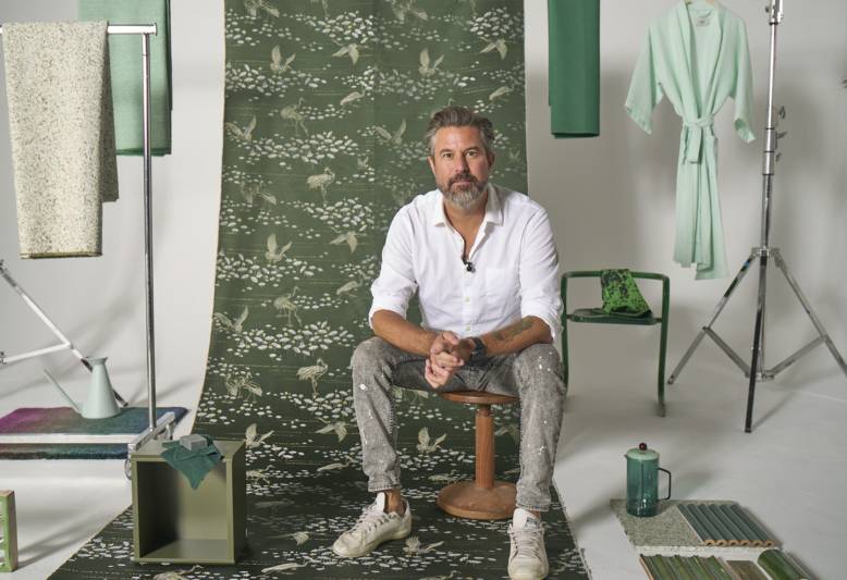
I always say that there’s a sustainability in beauty. You create a home with materials and colours that are genuinely beautiful, that are not too on-trend, that are not just a fleeting affair but are more like a declaration of love. If you do things this way, you will also create something that will last for this generation and for the next.
What color are you?
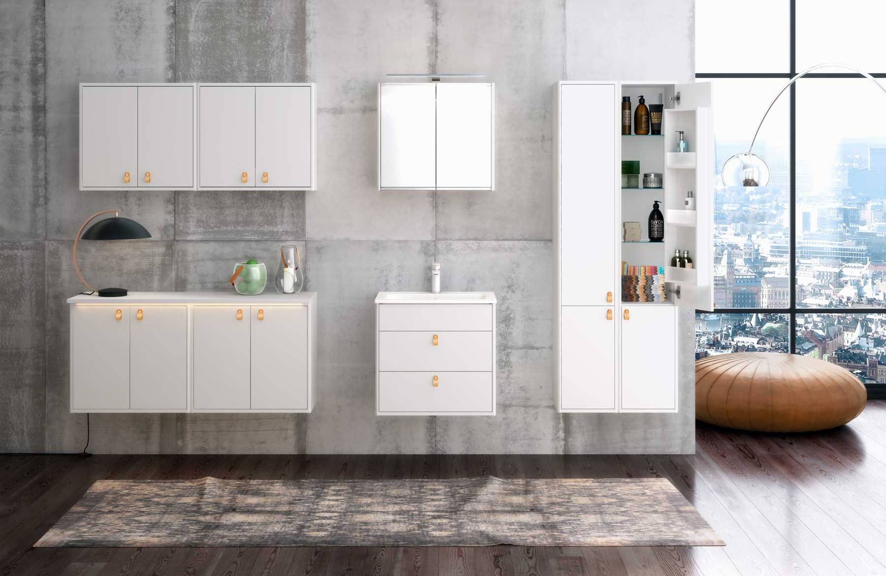
The colours in Gustavsberg’s palette – white, grey, black, green, peach and new beige – have been carefully selected to feel just right for a long time and perfectly complement virtually any other colour. The most common colors in the bathroom must be gray and white and they are always safe choices that last over time. But our other colors are also modern, fresh and have a timeless quality. We want you to enjoy your bathroom for many, many years to come and therefore offer a color palette that will feel right today and tomorrow.
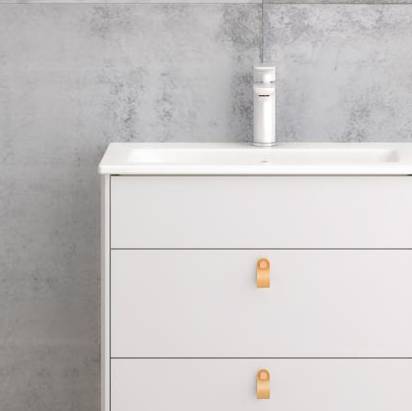
Regardless of the color you choose for the furniture, the cabinet frame, doors and drawers are the same color, which gives the bathroom a calm and uniform color scheme.

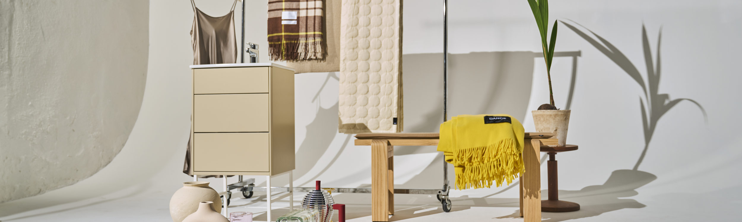
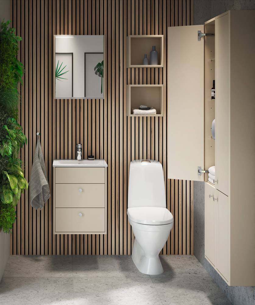
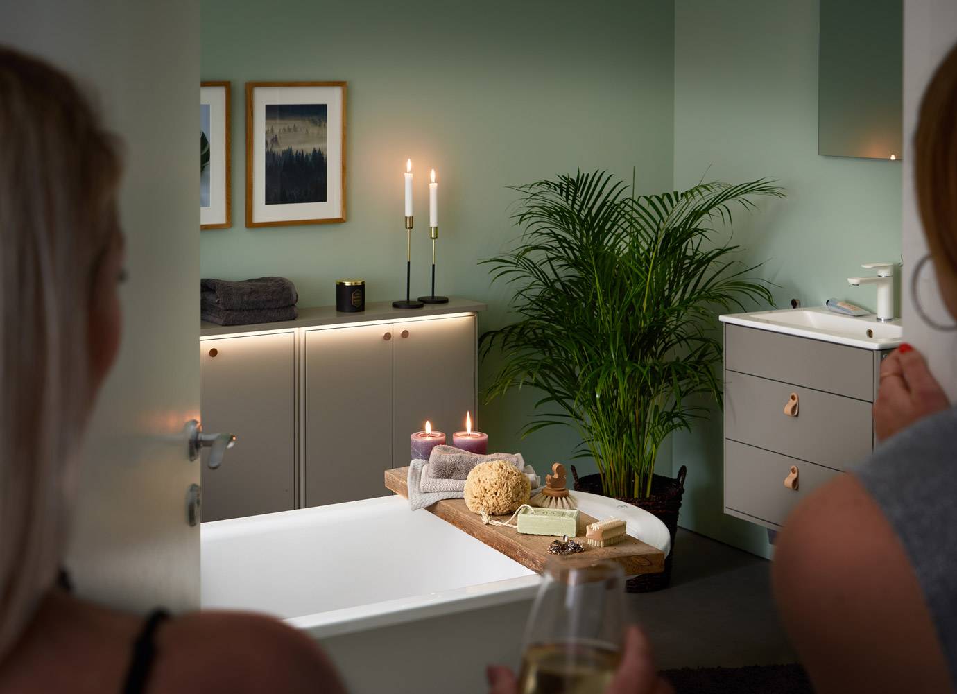
Beige - goes with everything
Beige has perhaps the least prepossessing name, but is nevertheless constantly being reborn in new trends; like now. Beige is durable in both time and space and there is a side of sustainability that is the long-lived, beautiful expression that makes things last aesthetically over time. One should find a level where there is a 1-1 between function and expression. Beige interacts well with other colors and materials and provides a nice balance.
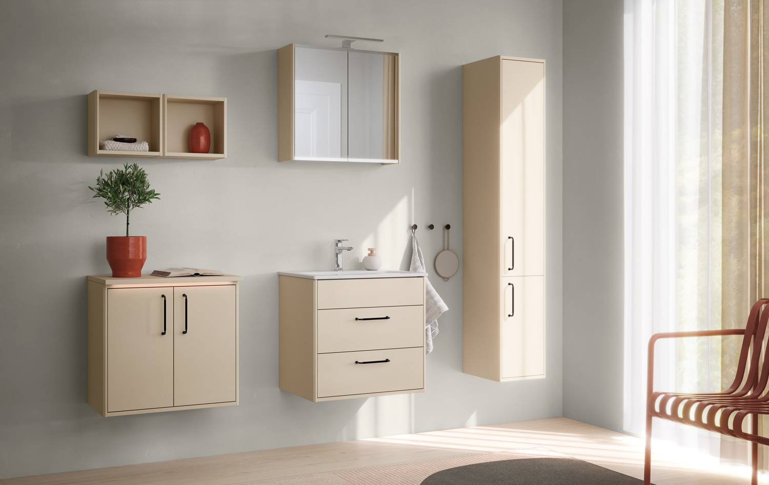
Beige is absolutely magical to work with because it gives you a very calm feeling. Surrounding yourself with beige is like sitting on a sand dune or in a tub of French nougat ice cream and just … being.”
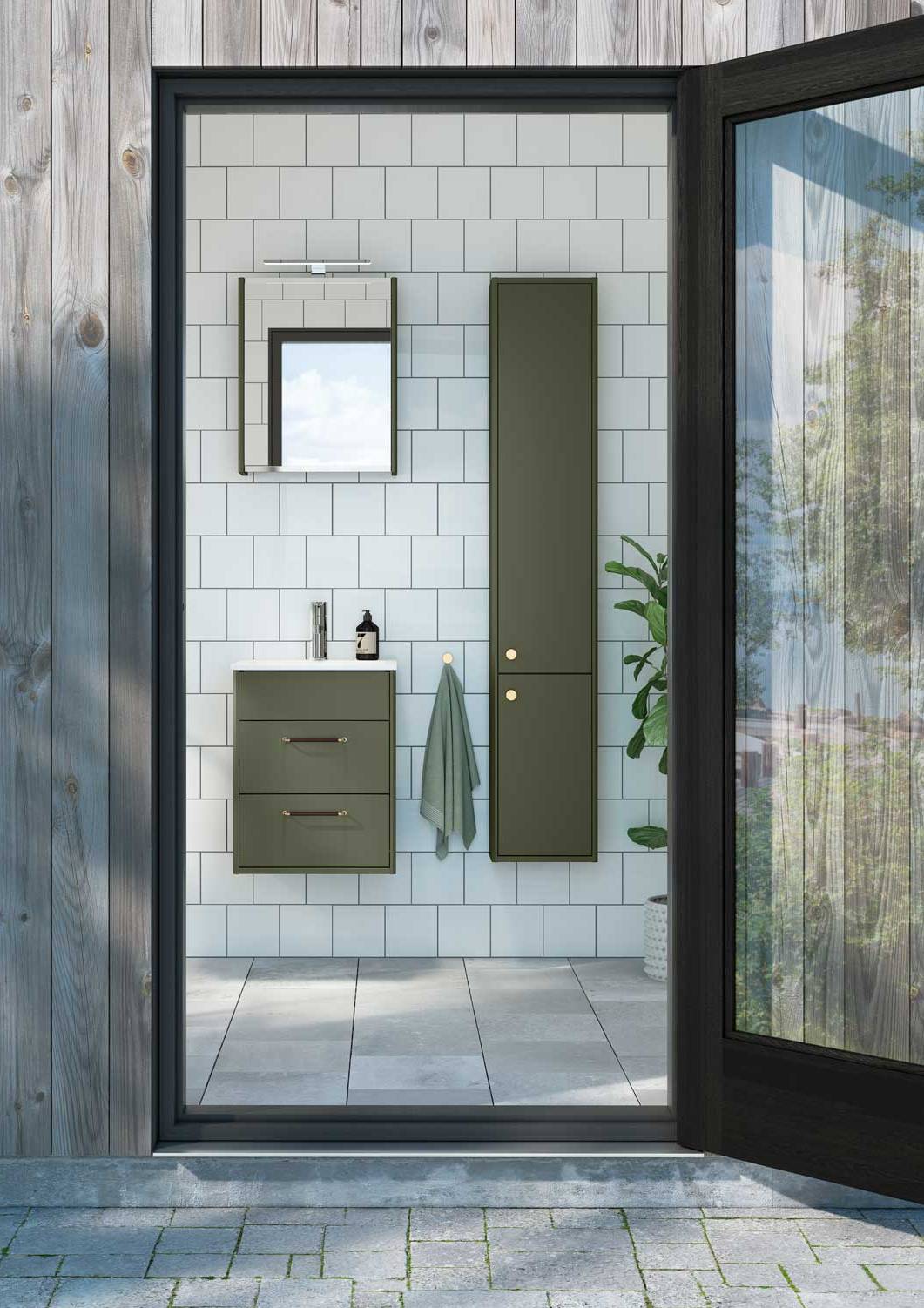
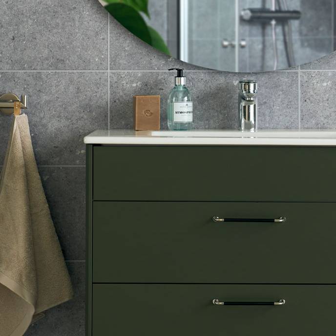
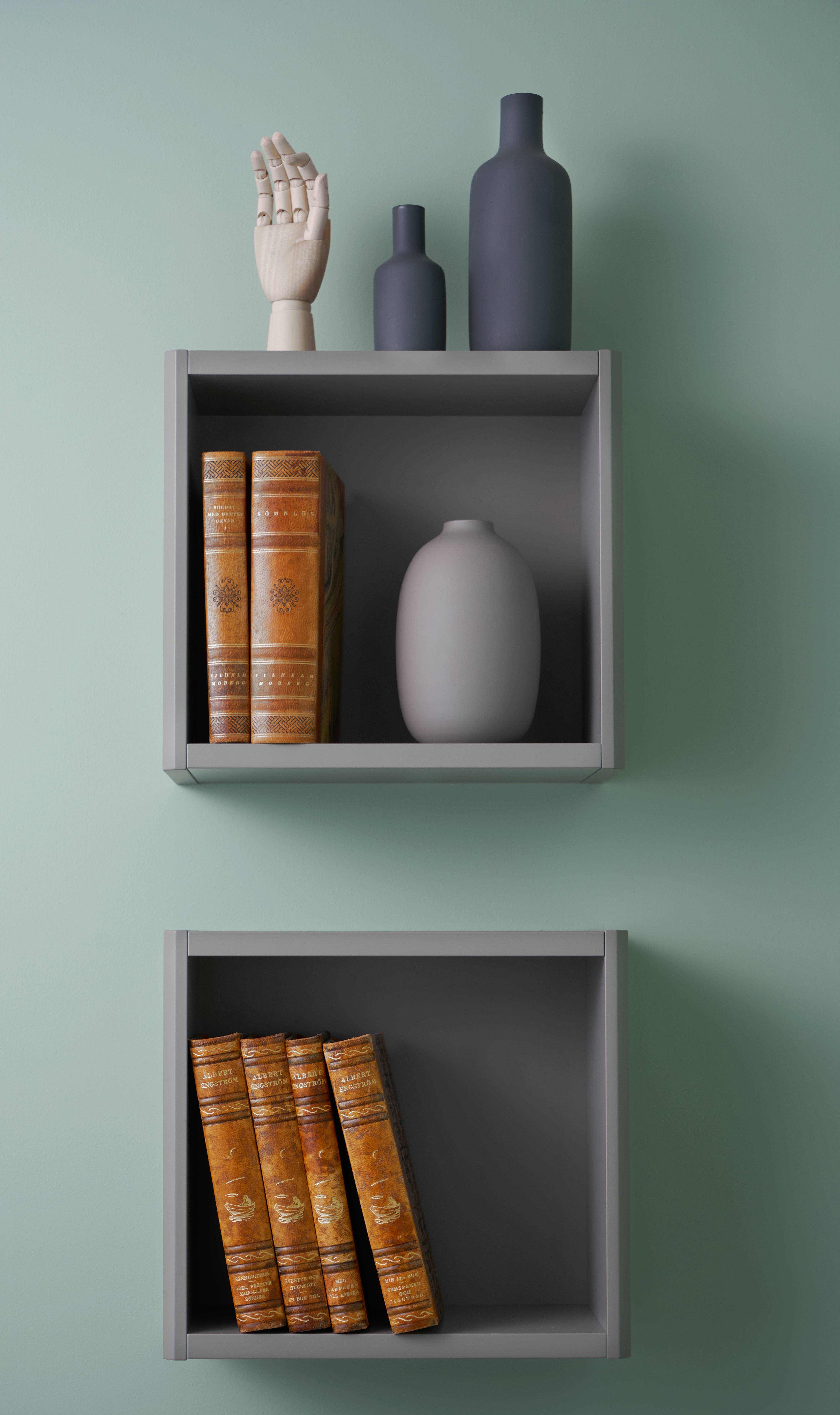
Green - the color of calm
Green is the colour of nature; and of harmony and calm. Graphic’s green shade is – in the same way as all things Gustavsberg – inspired by the crisp and durable greenery in our archipelago, where our story began many, many years ago. Elegant without being ostentatious, deep and fulsome without feeling heavy, comfortably softened so that it harmonises with pretty much everything else in your bathroom. Including you.
The feeling of being in a forest is something I think the vast majority of Swedes are very familiar with. Green is a safe colour, a calm colour, but it also exudes energy. Most importantly, green has a greater calming effect on the brain than almost any other colour. But we need some variation: we also need more lively shades to ensure that we get a spectrum of green. If you think about all the different shades you find in a forest – all the way from the grass and the moss right up to the leaves in the treetops – with green, you can squeeze in a lot of colour.
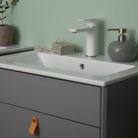
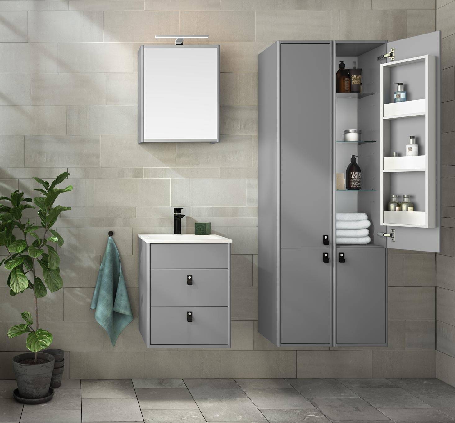
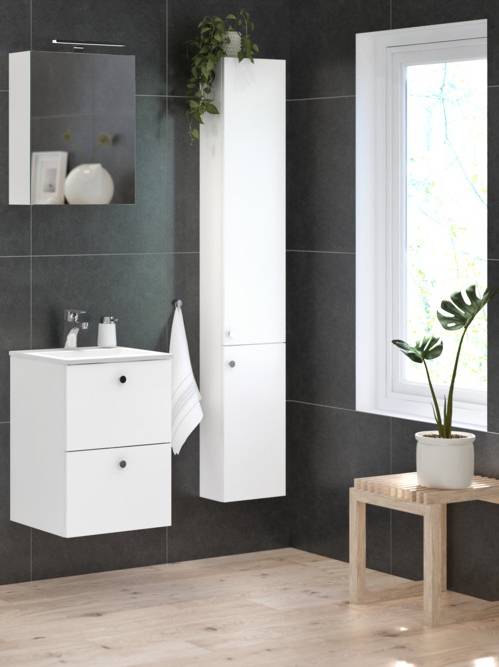
Gray - a universal elegance
The colour whose name means “dull” is actually – if you scratch the surface a little – many people’s favourite colour. Grey is much more than just a mix of black and white, and perhaps the colour’s finest quality is how its look changes depending on how light and shadow strike it. Graphic’s grey is a warm shade. It is wonderful to look at and, just like the rocks and stones of the archipelago, it forms the perfect background for a towel, for example, in strong natural tones. Gray is also one of the very few colors that really breathes – it breathes elegance.
Grey often conjures up a classic image of male elegance – but a grey bathroom does not necessarily have to be perceived as masculine at all, not with the right kind of soft materials and accessories. By adding more warm, earthy grey tones, we can create a more balanced impression and produce an elegance that is universal. But we can also take the opposite approach and use white and black elements as a contrast – just like we use black shoes to set off a grey uniform.
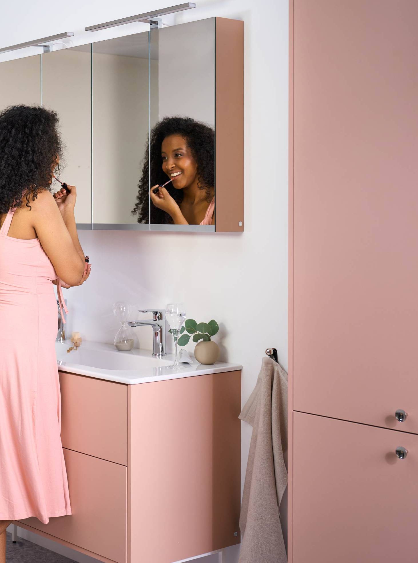
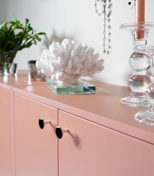
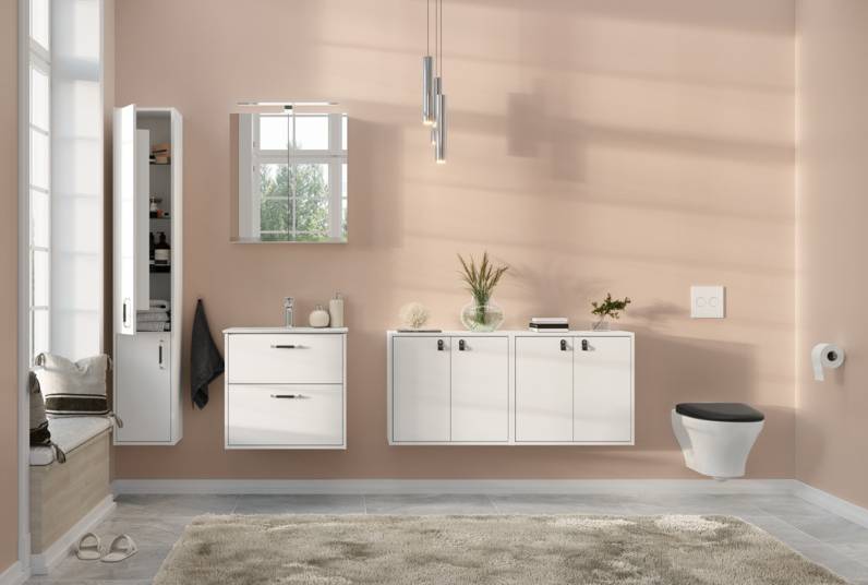
Peach – wide and fine spectrum
Peach is the most subjective tone in the Gustavsberg colour spectrum. The idea isn’t for it to disappear discreetly into the background. Rather, peach makes a statement, creating a bathroom with personality and warmth, obliging the viewer to have an opinion. Does it call to mind foundation rather than the fruit? Does it tend more towards red, pink or orange? Is it modest and elegant, or obvious and playful? We recommend peach for everyone who falls in love at first sight.
Pink is one of my favourite colours, bar none. It provides a very wide and inviting spectrum to work with, as yellow-pink slowly matures and slides into apricot, bright pink, right across the spectrum to burgundy, heavy autumn leaves and russet terracotta. The body should be able to relax in the bathroom, with no stress about brushing your teeth or whatever else you are doing, so I think pink, or peach, is a wonderful option.
Whatever colour you add to white, you will always get a strong contrast, but by working with slightly different shades of white, we end up with something that we intuitively know will be good. And when we’re talking about this spectrum, let’s not forget the gleam and chrome found in taps, towel hooks and other accessories. This gleam is something we see every day in water surfaces, in mirrors, we see it virtually everywhere in our daily lives, which also makes it very natural.
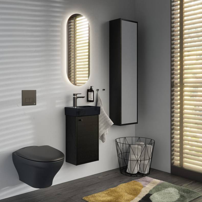
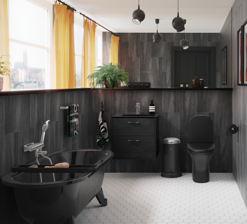
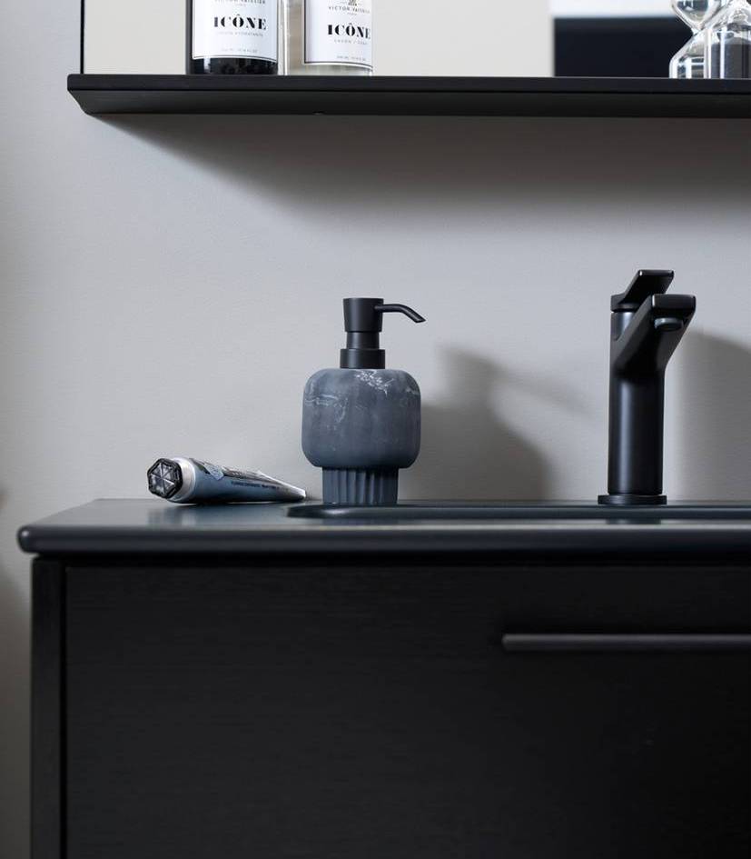
Black (ash veneer) – dramatic and vibrant
Ash simply thrives in our home territory of the Stockholm Archipelago – and in Finland, where we craft these furniture units from local material. Black ash veneer is both a colour and an emotion. The structure of the wood delights the fingertips and changes expression depending on how the light strikes it, bringing each furniture unit to life. Black ash veneer is the perfect choice for everyone looking for a little more drama in the bathroom – which can be reinforced with a washbasin in Ebony black porcelain.